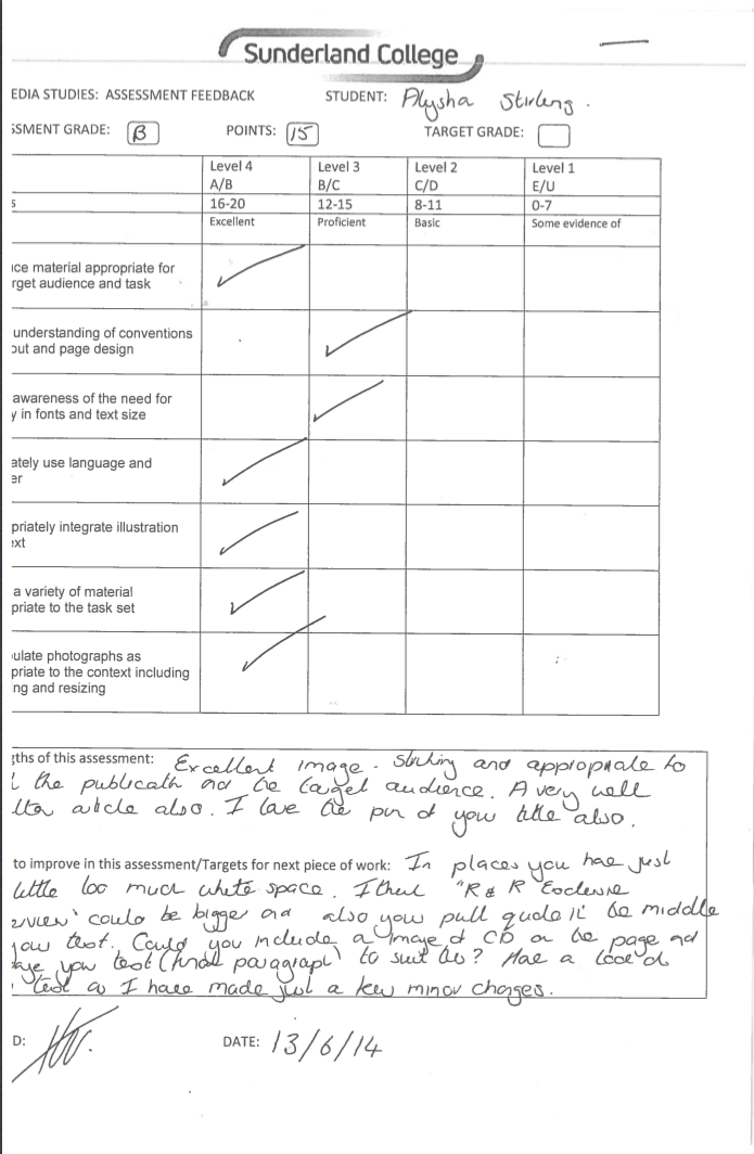
I didn't get as good a mark as I did for my front cover and contents page, I think this is because of the amount of white space which I have. The main things I had to change is the top 'R&R EXCLUSIVE INTERVIEW' text which was quite small and needed to be made bigger. Not only would this fill some of the white space but would also make a statement that this article is an 'exclusive' piece. Another thing I needed to do was create an album cover which I could match with the article and feature on the bottom of the page to fill further white space. I did this by using one of my pictures and editing it on photoshop to create a CD cover.
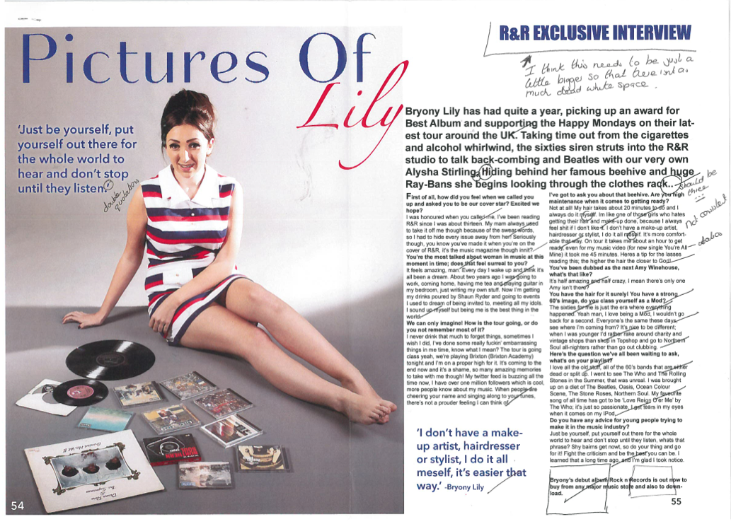
Here is my improved double page spread below!
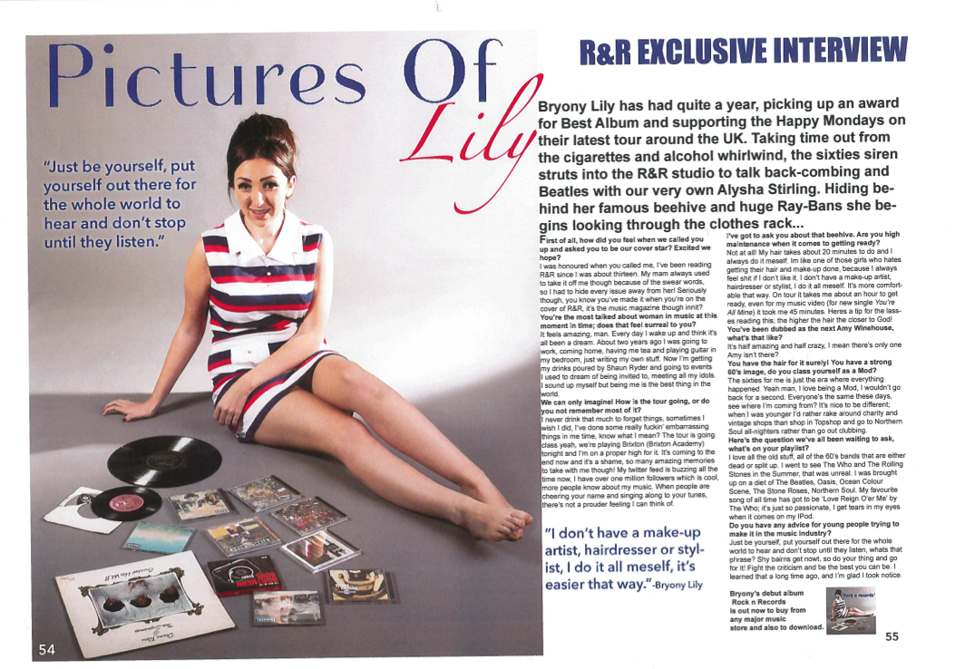
My lecturer commented underneath this post stating further improvements I could make to my work. I have made these further changes and feel as if they make the double page spread look better as a whole. I changed the size and positioning of the pull quote, made the width of the paragraphs wider and made more space between the introduction paragraph and beginning of interview.

Alysha - can you please se me about your d.p.s as i think that there a couple of things that you can improve even further :0) The pull quote on your columns could be spaced better and also the kerning between the kicker and the columns could be bigger x
ReplyDeletePS it seems a little wonky here and the version I saw wasn't?
ReplyDeleteHi Helen,
ReplyDeleteIt's only wonky because of the way I scanned it into the computer :) I'll make sure I change the pull quote and the place of the paragraph x