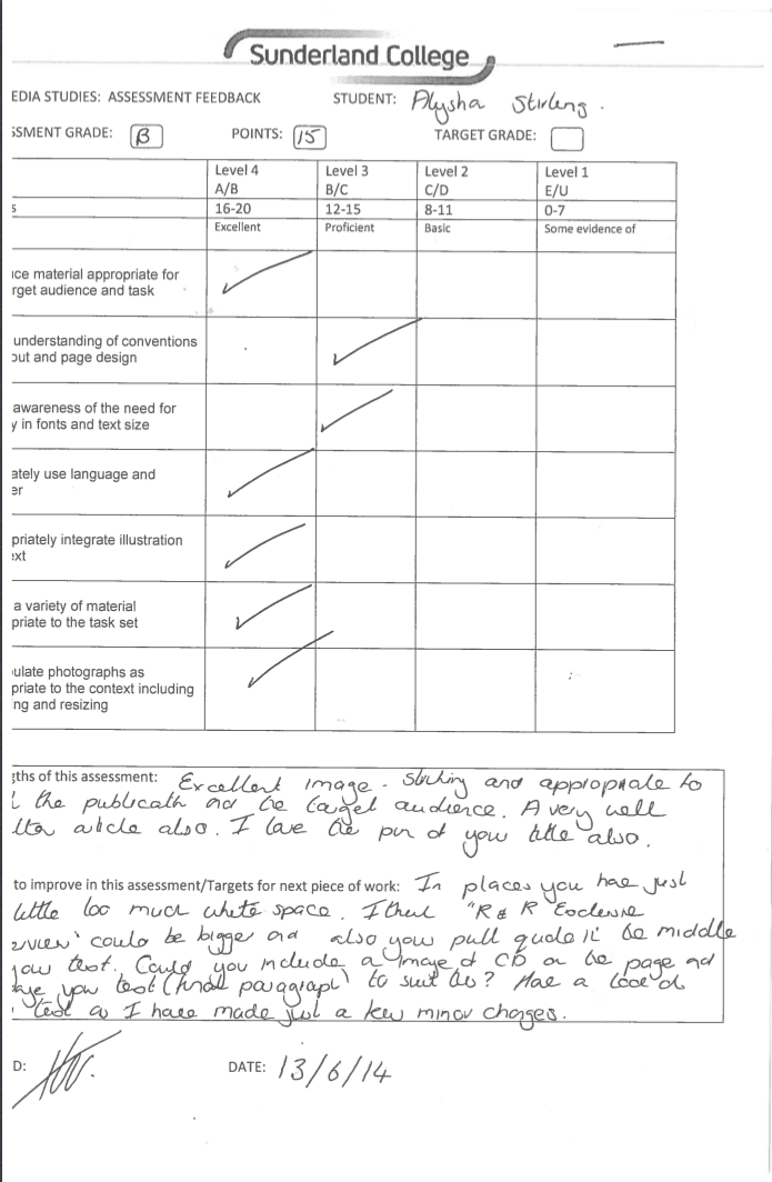
My front cover

My contents page

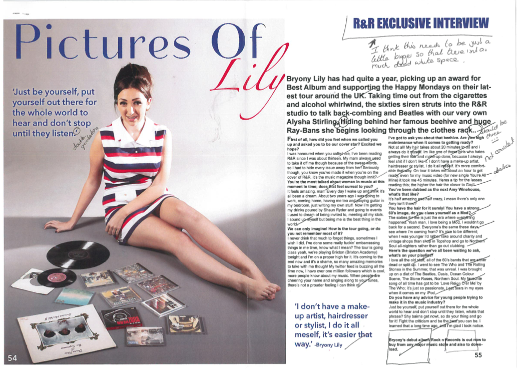
My Double Page Spread


 An R&R reader would be interested in the 1960's Rock and Roll/Mod music scene. Just like the cover model, they will dress in vintage clothing and follow mod culture by their style and taste in music. They will listen to Northern Soul, Rhythm and Blues, Rock and Roll and Mod bands such as The Jam, The Who, The Small Faces and The Kinks. As well as modern Britpop/Mod bands; Oasis, The Stone Roses and The Strypes. They will spend their money on the latest CDs or Vinyl, smart expensive clothing and gig tickets. Both male and female readers will dress in brands such as Fred Perry, Pretty Green and Art Gallery Clothing. They will also shop on the high street for some of their things. Men will wear the famous Mod style Parka and Desert Boots. They would go out to Mod/Northern Soul events or gigs, watch films which would reflect their interests; The Boat That Rocked, Quadrophenia, Spike
 My target audience would wan to by my magazine because it refers to how they dress and what they listen to, which would make the magazine more personal to them. It also includes information on bands and artists they like, as well as free CDs and Posters of Paul Weller, which they would be able to add to their bedroom wall.
 When looking at both of these images, both postures of the women are the same. I have used the image of my cover model Bryony along with the late Amy Winehouse who was very famous for her vintage style. Both are standing and photographed at a direct angle with their outfits on view. Bryony is carrying props (records) but Winehouse is not holding anything, she has her hands by her side. Theyre facial expresions are dfferent, with Bryony conciously posing for the camera and Winehouse looking down towards the ground and smiling. Bryony looks a lot more seious whereas Winehouse looks relaxed and carefree. Both women are Fred Perry polo shirts and pencil skirts with bare legs, the only difference is that Winehouse is wearing a black shirt and a belt as an accessory. Winehouse is showing more cleavage for a more provocative look. Not only are the outfits similar but both women are sporting beehive hairstyles. The difference is that Winehouse's hair is longer and styled a little bit differently, it is also a darker colour that Bryonys. It is clear that both images have been photographed in a studio because of their clear backgrounds and the lighting, the image of Bryony has a darker backdrop than the image of Winehouse, which can be edited. The lighting in the image of Winehouse is a lot brighter than in the image of Bryony, and Bryonys face is not completely visible due to the prop and the slight shadow it creates.
  Overall I think that both of these images represent a young social group who like to shy away from mainstream fashion and music. They like to look different and stand out amongst other people in their age group. Because they are so different they are seen as very confident by other people who see them for their individual style and the way they carry it off. Fans and readers will aspire to be like them because of their confidence and their rebellion against mainstream society. People will relate to them because of what they wear and what they are like as people. They aren't wearing really expensive clothing unlike girls in high fashion magazines, for this they will be admired by girl fans. Everyone featured in my magazine look normal but stand out because of their vintage style look and the way they present themselves by either their outfit, hair or make-up.
 My masthead is R&R, which presents the genre of my music magazine. I thought that not only does it represent my genre, but also it is short and catchy just like 'NME' or 'Q.' The masthead is a typical convention of a music magazine which I have adapted to my own. All magazines use this feature to make the audience know the name of it and also to give the magazine recognition. I looked into a range of different mastheads so I could see what type of font was used and the types of colours. I played around on a website called dafont.com


 The main image was taken at Sunderland University photography studio, my friend Bryony was happy to be my model and I styled her to fit the genre of my magazine. I have focused on 60's rock and roll, therefore I used props and costume to relate to this. In terms of mise-en-scene, I used an old vinyl as a prop and styled bryony in a vintage style dress, 60's style make-up and a famous 60's style beehive. I have noticed that there are only a few magazines which style their cover stars to match the genre. Pop music styles their cover models in the latest fashions and trends. As I had chosen an old style genre, I had to reflect this through my cover model so my magazine looked similar. Through the styling and props I feel that the genre of my magazine is suggested quite well.
 The layout of my contents page could challenge the layout of other magazines, this is because I have only used one page when some magazines only use two. I chose to use one because I thought it personally looked better. I have used a range of navigation bars to direct the reader to the different stories and things in the magazine. A lot of magazines do this, for example MOJO magazine and Q Magazine use this feature to break up the text and easily guide the reader. I have written my own editors note which is another convention used to make the magazine more personal to its readers. I also broke up the text by using a few images that I have taken from gigs that I have been to, and layered the page numbers over the top.
 As quite a lot of magazines do, I have featured a subscription box on my contents page, this is another typical convention of a magazine in order for the readers to save money. I decided to have a subscription box because it made my contents page look more professional and also filled up space which I had. To go with the subscription box I made a different front cover with another picture and my own front cover as a few examples. I looked at other subscription boxes and found that they had a few images of past magazine covers to advertise themselves. The colours of the box were also different, being red and white it still stuck with the colour scheme but stood out on the bottom of the page.


