Thursday, 26 December 2013

Creating my double page spread article

Before putting my DPS article together, I wrote the article which I got feedback on to improve. I looked at different examples such as NME and MOJO to see what they wrote their articles like and took inspiration from them to create my own. I wanted my article to sound relaxed and quite informal which sounds a lot more personal and easy for the person reading it. I also used colloquial language to make it sound more informal and fit more to the rock n roll genre, I also used elements of dialect to emphasise Bryony's accent which I had seen featured in NME.


I decided to have quite a basic but effective layout for my magazine, originally I planned to use more than one image and have less writing, I got a different idea from an issue of NME where the article only had one strong image and thought this would look more proffessional. I carefully chose my image of the cover star because on both the cover and contents page she has her face covered by a record. In thi article it gives the reader a chance to see the model properly, sporting a smiler shot to make her look youthful and carefree. I made a few improvements to my written article from the feedback I got from my lecturer.

Friday, 20 December 2013

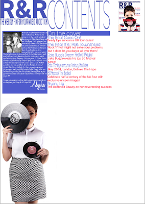
Progress Post- Contents Page

I have finished my contents page after making a lot of improvements and changes. My first design of my contents page was meant to be landscape, which went against my flat plans but I thought I would be able to add more information and images if I had two pages.
When I set up my contents page, I didn't like the way it looked and thought it would look neater and more organised with just one page. I also discovered that most magazine contents pages were just one page rather that two. I kept the navigation bars, editors note and the same masthead and began to re-create my contents page.
Here is my finished contents page! This is a lot more similar to my intentional flat plan and I feel as though it looks a lot better. I have shown contents page conventions, such as the editors note, navigation bars, page numbers and subscription boxes. I have included below some close-up images of my contents page:


Wednesday, 18 December 2013

Progress Post: Front Cover

After feedback and improvements I have finally finished my front cover of my magazine! I've taken on board all of the feedback I have been given to make my product look better and more professional. Here below is my up to date and finished front cover:

As you can see it looks quite different to my first attempt, I have experimented a lot more with different fonts to make my magazine stand out more and look a lot more appealing. I have taken screenshots to show the conventions of my magazine cover which I have changed throughout creating it. At first my design was very basic, the fonts were all the same and the colours were quite hard to see, I also had a button on the magazine to advertise a cover-mount, but I removed it and put a banner along the top to make the magazine look more professional 

The image below shows my third attempt at my magazine front cover, I started to use different fonts for my sell lines and added the banner, I also changed the colour of the main sell line 'Bryony Lily' to red and used a drop shadow to make it stand out. The other thing which I changed after this was the pull quote on the record which was far too thin and faint. I changed the banner at the bottom so it matched the one at the top of the magazine. I am a lot happier with the way my front cover looks and think I have made a lot of positive progress to change it and make it look more appealing.


Tuesday, 10 December 2013

Starting my Contents Page


As my contents page is complete, I've now started to design and put together my contents page. It is different to my flat plan because I thought it would look better with more images instead of lots of writing so the image could break the text up. So far I have my editors note which I have written by looking at other examples in magazines such as MOJO and Q magazine as these magazines match closely to my genre of music I'm focusing on. I'm sticking with the red, white and blue theme so the magazine looks uniformed. I'm going to add some images which I have taken from gigs, as images like this are normally featured in contents pages along with the page numbers beside them. 
I have chosen sell lines which link to my genre, as well as the enigma codes. I will update as my progress of my contents page goes on, 

Sunday, 8 December 2013

Preliminary Task - College Magazine

For my preliminary task I was asked to design a possible college magazine. Therefore this magazine had to be within the target audience of 16-19. We took our own images for this magazine so we could apply them to our chosen sell-lines. I thought a lot about the target audience when I was designing, I made the magazine £1 so it would be affordable to students, and also picked a unisex colour scheme of green and orange, which also match the files that the model is holding on the front cover. My lecturer liked the way I incorporated the colours of props into my magazine, and said it was a 'stylish design technique.'
To improve this front cover I would make sure that the sell lines where filling in the white space more than overlapping the main image, and also experiment with different for sizes and styles. 
 
My contents page was quite basic in terms of design because I didn't have very much experience with Photoshop.
I still kept the same colour scheme and added more images which linked to the sell lines, I also put the page number on the image it referred to so the reader could easily find it. I think I could have improved this by making the sell lines smaller so I could fit more on, and also make sure that the images I included arent stretched out of proportion. I liked the background of the contents, to do it I used the blending options to make things  more opaque but still lightly visible.