Tuesday, 29 October 2013

Specific planning- hair, make-up and costume

In previous posts I discussed the make-up, costume and hair styles I would consider re-creating on my model. Now I have a certain decision of exactly what I am using and how I will do it.


The outfits

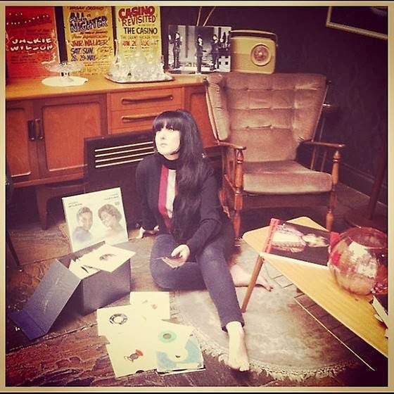
The two outfits I have chosen are my own clothes, I gave my model the choice of a few different things which represented my theme and genre. The reason I did this was to ensure that my model felt comfortable in what she was wearing. The dress on the right is one of the two things that my model has chosen. I will use the photograph of her wearing this on my front cover, as it is colourful and eye-catching.
The style of the dress and collar really captures a sixties style which is what I am trying to re-create in my photoshoot.


The second outfit is a cassic Fred Perry polo shirt with a Houndstooth check pencil skirt. This outfit wil feature on the contents and double page spread of my magazine, to give two different looks which is relaxed and slightly more dressed. Again these are my outfits which will save me money on buying/hiring clothes and I also don't have to worry about accessability.


The make-up

The make-up I have chosen is going to be based on Twiggy and Jean Shrimpton. The eyeliner will be thin, with a dark eye crease and nude lips with a pale foundation base. I will use all of my own make-up to get this look, and will also buy false eyelashes to make the eyes stand out and look more effective on camera.
 The hairstyle

Finally, the hairstyle I have chosen will be a beehive as it represents the 60's theme perfectly, being one of the popular hairstyles of that era. To achieve this look, I will need to backcomb the hair, use lots of hairspray and grips to make sure it keeps in place and will stay perfect and neat through the photoshoot. Here is an example; The Ronettes sporting their famous beehives.


Specific planning- message to my model


I organised in person who my model was going to be and asked them if they were happy to do it. My friend Bryony is my chosen model, here on the right is the message I sent to her to confirm everything. I also asked her which clothes she would like to wear so she feels comfortable. Although I did give her a choice of different things so that her outfit still linked in with my genre and theme.


Specific planning- Confirmation of studio booking


Confirmation of booking studio space

I have booked the photography studio at the University of Sunderland to take my photographs for my magazine. I first of all had a look around the studio to see what it was like and also if it had any health and safety hazards I needed to know about. The studio is the perfect venue, with professional equipment to make my photographs high quality. Not only do I have access to the studio but there is also a dressing room which I can use to do hair and make-up for my cover model.
In order to book the venue, I had to get in touch with Colin Young from Sunderland University to enquire about when the studio was free. In a group, myself and my friends organised which days we could do, and we were also told that we could miss one of our media lessons if necessary to get the photographs all taken and sorted. I got in touch with him by email and organised to book the studio for Monday 4th November from 1pm-5pm. The reason I needed a four hour slot is because I will be coming with two of my friends who are also doing their photoshoots. To show my booking confirmation, I have listed print screen shots of my emails I sent and recieved. Colin also needed to know what I wanted in terms of lighting, backdrops and what props I would be bringing in to include in the shoot. This is so he can set it up for when my cover model and I come to the studio.


Sunday, 27 October 2013

Reader Profile


Girls..
A typical girl to read my magazine would be aged between 16-25 years old. She will enjoy listening to Rock and Roll music and will obsess over her favourite bands. She will have posters all over her bedroom wall, along with ticket stubbs from past gigs she has attended. She will be at college or university, and maybe have a part time job or full time job which buys her gig tickets, clothes, the latest CD/vinyl and pay for nights out with her friends. She will listen to music such as; The Who, Oasis, Jake Bugg, Rolling Stones, Beady Eye, The Stone Roses etc. As for clothes, she will shop in charity or vintage stores to try and find vintage clothes to express her individuality, not only will she shop in vintage shops, but also high street shops such as; Topshop, H&M and Primark. She will be in the ABC1 social group and be up to date with the latest technology.
 
 
Boys..
Just like the girls, the boys will also love going to gigs and listening to the same music. Their hobbies will include going out drinking, socialising and football. They will be either at university, college or have a full time job which gives them their income to fund their social lives and expensive clothes. The boys will make an effort with their appearence and will take pride by buying designer clothes. They will wear expensive clothing brands such as Fred Perry, Levi jeans, Weekend Offender, Vintage mens clothing, Adidas and Clarks Desert Boots. The boys will also play FIFA and watch programmes such as Match of the Day. Just like the girls, they will be in the ABC1 social group. 

Friday, 25 October 2013

Media Production: Photo shoot Planning

I want my photographs to present a relaxed emotion, focusing on the 'moody' look which most people in my genre of music are presented in magazines. Take this for example; Jake Bugg is presented on this front cover of NME with a relaxed expression, his eyes are looking straight down into the camera to make the reader think he is looking directly at them for a more personal, effective touch. This is the impact I would like my photographs to have, because I think it looks mature and laid-back which is the attitude of my target audience.
I am going to use my friend Bryony as my model to photograph, I will dress her in a way I feel represents the genre of my magazine. As for my personnel, I am doing make-up, hair and costume, but my friend Courtnie will be there to help with equipment.
For props I am going to buy a vinyl record for my model to pose with, I am also going to bring in CDs of the genre and use them as props. I am considering photographing my model at a high angle so that she is sitting with all of the CDs around her.
I am going to emphasise colour through the lighting I will use. Also through the outfits my model will be dressed in. I have briefed my personnel and models and organised when we are going to take the photographs. I have also asked what they will be confident wearing and they have agreed that they are fine participating in the shoot. 
I will need quite high key lighting, this will be possible because I am shooting in the studio of the local uni, I am also going to need a white background. I have chosen the white background to make my model and props stand out, I also think it will make things more effective. I know exactly what props I need and I know that I will be able to use them because they are mine.
I have organised the make-up and costume and know exactly how I am going to present my model. I'm going with the sixties theme and will use all of my own clothes and make-up for the shoot. My model will be dressed in a vintage sixties style dress with dark eye make-up, fake eyelashes and a sixties beehive hairstyle. I plan to do all of the hair and make-up myself because I know exactly what I want it to look like. 

Thursday, 24 October 2013

The Recce

I am shooting my photographs at Sunderland University photography studio, so the health and safety risks are mainly trailing cables, and also tripping over the black material on the floor which my model will be standing on. However, I will make sure that these risks are kept minimal by keeping the cables altogether and not in peoples way, and also make sure the material is straight so people don't trip over it.
If I was doing an outdoor shoot I would have to consider the weather, but as I'm in a studio I won't have to worry about it effecting the photographs. I want a white background which is possible because of the backdrop in the studio, again the lighting I have will be artificial so I will have to consider the brightness. If I was to use natural lighting it could effect the photographs depending on the weather. I will need to use a flash to make the shot high quality. I have considered that the bright lights could leave a white glow around my model so I will have to make sure that the lights aren't too overpowering. I have got permission to take photographs in the venue I'm using, I just need to book it when it is free, I am booking the Sunderland Uni photography studio, which I have been to look at and I think it would be a great place to take my photographs. 
The only people with me are going to be my model and also another two girls who are also doing their photo-shoots. We have organised when we are all free and need to email to ask when the studio is free. Not only is there a studio but also a dressing room where I can do my models hair and make-up. 


Wednesday, 23 October 2013

Institutional Research

Emap
Emap is a British media company founded in 1947, based in London. The company is owned by Apex and Guardian Media Group  EMAP specialise in business to business magazines and also organising specific business events and conferences. EMAP currently have 20 magazines in their portfolio, including;


Previous magazines include;

It has recently been renamed Top Right Group and that all magazines and business would be separated three ways, but the EMAP name would continue to be used for the magazine purpose.

Conde Nast
Conde Nast is a magazine publishing company based in the US. They publish fur business to business publications, 27 websites and have more than 50 apps for mobile and tablets. It is said that they are the originator of 'lifestyle' magazines. They currently produce 18 consumer magazines, mostly fashion/lifestyle based. The magazines are really well known; 


These are just some of the magazines which are produced by Conde Nast.


Natmags
Natmags was a London based British magazine publishing company which was established in 1910. It stands for National Magazine Association, in 2006 Natmags became digital by buying women's website handbag.com.
In 2011 Natmags and Hachette Filipacchi Medias merged and formed Hearst Magazines UK.

Here are the magazines published by Natmags;

  • Best
  • Coast
  • Company
  • Cosmopolitan
  • Cosmopolitan Bride
  • Country Living
  • Esquire
  • Good Housekeeping
  • Harper's Bazaar
  • House Beautiful
  • Men’s Health (UK only)
  • Prima
  • Prima Baby
  • Real People
  • Reveal
  • Runner's World (UK only)
  • She
  • You & Your Wedding
  • Zest magazine

Magazines published by Hearst Magazines;
IPC Media
IPC creates content for multiple platforms, using print, online and tablet publications. It is the UK's leading consumer publisher with over 60 iconic media brands and was produced in 1963, following the three leading UK publishers merging together to form IPC, the abbreviation for The International Publishing Cooperation. IPC publish well known magazines such as NME, which was the music scenes main and most popular magazine in the 1950's. they engage with almost two thirds of UK women and over 40% of UK men.
Here are the 60 media brands which IPC publish in the UK;

Future Publishing
Future Publishing is an international media group and also a leading digital business. They create their content for their readers on a lot of different technology, such as online, on tablets, mobiles and in print. They specialise in the Technology, Games, Film, Music, Women’s Creative, Photography, Creative & Design, Sport and Auto type of magazines. It publishes over 150 magazines, and is the official magazine company of all three main games console manufacturers. The company was founded by by Chris Anderson in 1985, and he left in 2001. 
Underneath is the all of the magazines and websites associated with Future Publishing; 


Bauer Media Group
Bauer is Europe's largest privately owned media group, the Group is a worldwide media empire offering over 300 magazines in 15 countries, as well as online, TV and radio stations. Bauer is a multi-platform media group, which stretches back to 1953. In 1994, the company bought a small magazine with the title For Him, which now is the best-selling lads mag FHM. They also owned Box TV, which was a music programme that merged with Channel 4, becoming 4 Music. Bauer is headquartered in Hamburg and operates in over 16 countries worldwide, the start of Bauer in the UK began with the launch of Bella in 1987. 


Sunday, 20 October 2013

Hair ideas

Stacie Stewart, cook and Mod, with her beehive
and blunt fringe she models a classic
60's hairstyle perfectly.
Myself, with a beehive and arched
fringe with flicked sides, another classic
60's look.
Carrying on the sixties theme, it was all about big hair, especially the Beehive style. I wear my hair in a beehive a lot, so would know how to style my models hair by backcombing it and pinning it up to create that classic look. Here are some examples of popular 1960's hairstyles;


Make-up Ideas

Make-up is very important when it comes to a photoshoot, especially when you are creating a look. I am following the sixties look when it comes to make-up, and here are a few examples of what I am aiming to create. I have looked at sixties icons such as Twiggy and Jean Shrimpton and looked into how they wore their make-up. The basic idea is a subtle/strong line over the crease of the eye and eyelashes drawn in at the bottom of the eye for exaggeration. The eyeliner is quite thin, so the false eyelashes are highly visable. The base/foundation is quite pale, with bronzer to highlight the chee-bones, making them look more structured. This make-up will really stand out on a front cover, as the two images below are both magazine covers and I think they look classic and affective. A modern day sixties make-up look is that of Lana Del Rey, who is shown below. Like Twiggy and Jean Shrimpton, she is sporting a pale foundation with bronzed cheekbones. Her eye make-up isnt as exaggerated, but the eyes are lined thickly with cat flicks, which is another option from me to choose from.


My make-up kit
 
This is the make-up I will be using on my model;
 
Foundation/base: I will use Benefit Hello Flawless! Foundation in 'ivory,' because it is a pale shade but still gives the model a bit of colour to make her look healthy and flawless. My bronzer is MAC Mineralize skin finish natural bronzer, I will use this with the MAC brush to apply and give the cheek-bone effect. The bronze will stand out against the pale foundation to reveal that sixties look.

 
The eye make-up:
First of all I will use 2true liquid eyeliner to line the edge of the eyelids, to draw on the crease I will use a Body Shop eyeliner pencil which is thin and will make the line neat. I will also use this to draw on the bottom eyelashes because it will be easy to use. To pencil in the eyebrows, I will use Rimmel eyebrow pencil, which will draw more attention to the eyes and add more definition on my front cover. The Benefit Bad Gal eyeliner pencil is thicker and would be great for the water-line of the eye. The false eye-lashes I will use are Revlon, which will be applied with the strong and fast drying Benefit Lash Glue. Finally I will use Bare Essencials High Definition mascara for an extra lash volume boost.


Costume ideas

With my genre being rock n roll, I am going with a sixties/mod theme when it comes to costume and representation. I have researched and found a number of images of classic sixties looks that I will consider recreating for the front cover and double page spread images that I will take for my magazine. I will either have my cover star wearing one of my vintage 60's dresses or a Fred Perry polo and pencil skirt for a more casual approach. The images below are examples of how I will present my cover model.


Wednesday, 16 October 2013

Flat Plan: Double Page Spread


Colour Usage: I am going to use a black and white (monochrome) colour scheme for my double page spread, because it will match the costume of the model. The monochrome theme is classic and glamorous whilst also having contrasting colours. The background of the image will be white, because I am going to shoot it in a studio, therefore the page which contains the text will also be white to match. I would have the text in a black Times New Roman font because it's easy to read. 

Image Usage: The main image will be very strongly shot considering it takes up a full page. It will be a mid shot again like the front cover, this is because the reader will be able to see the make-up and style more closely which reflects the genre of my magazine. The camera angle will be direct for effect, I have not yet decided on the pose, but the cover star will be holding a record as a prop because it goes with the sixties/mod theme. The three images at the top of the second page will be a montage of shots, carefree of the cover star laughing and looking like she's having fun. 

Text Usage: Narrative voice will be quite informal, the use of swearing will be included but it will be quite conversation based, as if the person being interviewed is having a conversation. It is also appropriate for my chosen target audience to have a more conversational tone. For picture captions and my title and enigma code, I will include puns and alliterations. 

Layout and Font: The layout of the double page spread is balanced in the amount of images and text. I will use a simple for the small text, but for the title and enigma codes and also pull quotes I will use a different font which stands out. I have gone with the ideas of font that are stated on my design, although I will probably change the title font because they both look quite similar. I may put the title text on a slight diagonal so it stands out more, it also gives a quirky connotation. I will use drop caps at the start of the article to emphasise where the text begins. I could also use a watermark just like this example of Q below to give a different effect.


Flat Plan: Contents page

This is a flat plan for my contents page, again like the front cover it is very simple but will stand out a lot more when I add images and colours.


Colour Usage: The use of colour in my contents page would be the same as the colour scheme of my front cover. I will go with the red, white and blue theme, which will match and make the magazine look well presented and in uniform. I may change the colour scheme to black and white which is more clear and classic, it was also a popular choice in the questionnaire I created for a 'monochrome' colour scheme. In a number of ways it could also be more effective but personally I thought the red, white and blue would be more eye-catching. I will decide on colour finally when I come to create my magazine and see which type of colour scheme would be more effective. It might also be good if the contents page was a little bit different in terms of colour to differentiate it from the front cover.

Image Usage: The large image that I have indicated down the right hand side will refer back to the image on the front cover. It will be the largest image on the page because it is the main article. This large image will be a close up of the cover star, maybe a profile of one side of the face which will stand out and show off the make-up and facial expression. I also thought it would be a good idea to use the idea of placing the page number on the image that matches it. The two other images at the bottom of the page will be one image referring to each navigation bar. For example; an image of a live band or an image of an album cover for gig and album reviews, and an image of the person who will be getting interviewed to relate with the interviews navigation bar. The image of the person who is getting interviewed would be a mid shot to give a clear profile of them. Their body language will be relaxed, maybe with their arms folded and a straight look into the camera to make the image look personal to the reader. They will be holding a copy of their album as a prop. The texture of the images will be quite sharp and high quality.

Text Usage: The narrative voice will be the same as used on the front cover. Of course the contents page is there to advertise the articles of the magazine, so I will use alliteration, imagery and enigma codes to make the sell-lines sound more interesting so people will want to read them. I would like to come across as quite informal but still professional on the contents page, so it sounds more personal and as if I am having a conversation with the reader. The masthead will be featured again on the header (title) of the page, next to the text 'contents.' The two images would have captions which will be amusing (puns) referring to what is happening in the image, the name of the person will also be included for identication.

Layout and font: The layout of the contents page is easy to understand, with navigation bars which will have the relevant articles underneath so the reader can find them easily. The page title addresses what the page is, and will also include the masthead to match the contents page with the name of the magazine. The main image will be down the right hand side of the page, and will be of the cover star. I have not noted this on the plan, but instead of the image being so long, I would cut it halfway and have an editors note at the top of the right hand side for the reader, which will explain certain parts of the magazine and be a nice, personal touch. The fonts of the articles will be the same as the front cover, and will be in white with the enigma codes underneath them in red. I would have a blue background which the writing would stand out against. Again going with the red, white and blue colour scheme. The font of the navigation bars will be in bold so they stand out and come across as headers.


Tuesday, 15 October 2013

Flat Plan: Front Cover


This is a flat plan of my front cover, it's very basic but just an idea of how my magazine will be laid out. 

Colour Usage: When I asked people about colours in my questionnaire, the most popular colours were red, blue, black and white. I'm going to use these colours because my target audience would like to see them in the magazine. It also refers to the theme. I would like to have a colour scheme of red, white and blue, this is because I was focusing on the British rock and roll scene for my genre and thought it would look good as they are the colours of the Union Jack. They are also unisex colours which would attract both genders. Red connotes passion and power and is also used by magazines such as Q and NME in their magazines because it is eye-catching. I think the colour red stands out because it is bright and eye-catching. The colours will contrast by applying for different things, for example; red for the masthead and white for the sell-lines.

Image Usage: I will be using a female model as my cover star, because I am going with the 'mod/60's' theme, she will either be dressed in a Fred Perry polo/shirt and pencil skirt or a vintage sixties dress. As a prop, I will buy a vinyl record which will be featured in the shot as it goes with the genre and theme of my magazine. The hair of my model will be back-combed into a beehive or sixties-esque style. Make-up will be quite natural, with a pale base, black cat eye eye-liner and red lipstick. The camera angle will be a mid-shot, not too close-up and also the look of the model will be visible. The image will connote the genre of the magazine as being quite classic, it will reflect the Mod/Northern Soul/ Rock & Roll genre through the clothing, props, hair and make-up. 

Text Usage: The narrative voice of the text on the front cover will be friendly and have a nice tone to welcome the reader. Quotes from the cover model will be colloquial depending on what they say and what will stand out. The enigma codes will be underneath the main sell lines as a teaser to make people want to buy the magazine. I will use puns, alliteration and metaphors to make my sell lines more interesting rather than just plain and straight to the point. 

Layout and Font: For the masthead and sell lines, the font will be quite basic and easy to understand. The masthead will stand out because it will be in a bold font and will be in larger writing at the top of the page. It will be at the top of the page to inform the reader of the magazine name. The sell lines will be placed at the sides of the main image so they don't overlap and make the lay-out too confusing or difficult to understand. I have chosen this layout because it is quite understandable and looks organised. The main sell line and enigma code which will match the main image, will be in a different font to make it individual and to stand out from the other sell lines which will also make it's importance shine through. 

Monday, 14 October 2013

It's Just Rock & Roll...


The genre have chosen to represent in my own project is Rock & Roll, from the 60's to present day. I'm a huge fan of bands/artists such as; The Who, The Small Faces, The Rolling Stones, The Beatles, Oasis, The Stone Roses, Jake Bugg and Arctic Monkeys. I thought it would be an idea to base my magazines around this genre because its personal to me and I have a lot of knowledge about it.
Here are some various images and music videos from the bands and artists which will be mentioned in my magazine..


The Who


The Who- My Generation

Posted on YouTube by polydorclassics
This song is one of the most famous and mainstream by sixties rock and roll band, The Who. It was originally released in December 1965 by Brunswick Records.


The Rolling Stones
The Rolling Stones- Jumpin Jack Flash
Posted on YouTube by TheRollingStonesHQ
Originally released in 1968. 
The video below is another by The Rolling Stones. 'Doom and Gloom' is more recent, it was released in 2012. Even though the Stones were a sixties band, they are still popular. They headlined Glastonbury festival this year (2013) and have also brought out a CD. I would feature them in my magazine for this reason, personally I love this band and would buy a magazine to read about them.
 Album artwork for GRRR! The greatest hits album released in 2012

The Rolling Stones- Doom and Gloom
Released November 2012


The Small Faces

The Small Faces- Tin Soldier
Posted on YouTube by WizardODoom
Released in December 1967


The Small Faces- Sha La La La Lee
Uploaded on YouTube by detour066
Released in January 1966.


The Beatles


The Beatles- She Loves You (yeah yeah yeah)
Posted on Youtube by Racheldr
Released in August 1963

Oasis


Oasis- The Hindu Times
Released on April 15th 2002


Jake Bugg


Jake Bugg- What Doesn't Kill You
Posted by JakeBuggVEVO
Released 23rd September


The Stone Roses


The Stone Roses- Mersey Paradise
Uploaded by MarkTurver1990